A KID CALLED ED2025

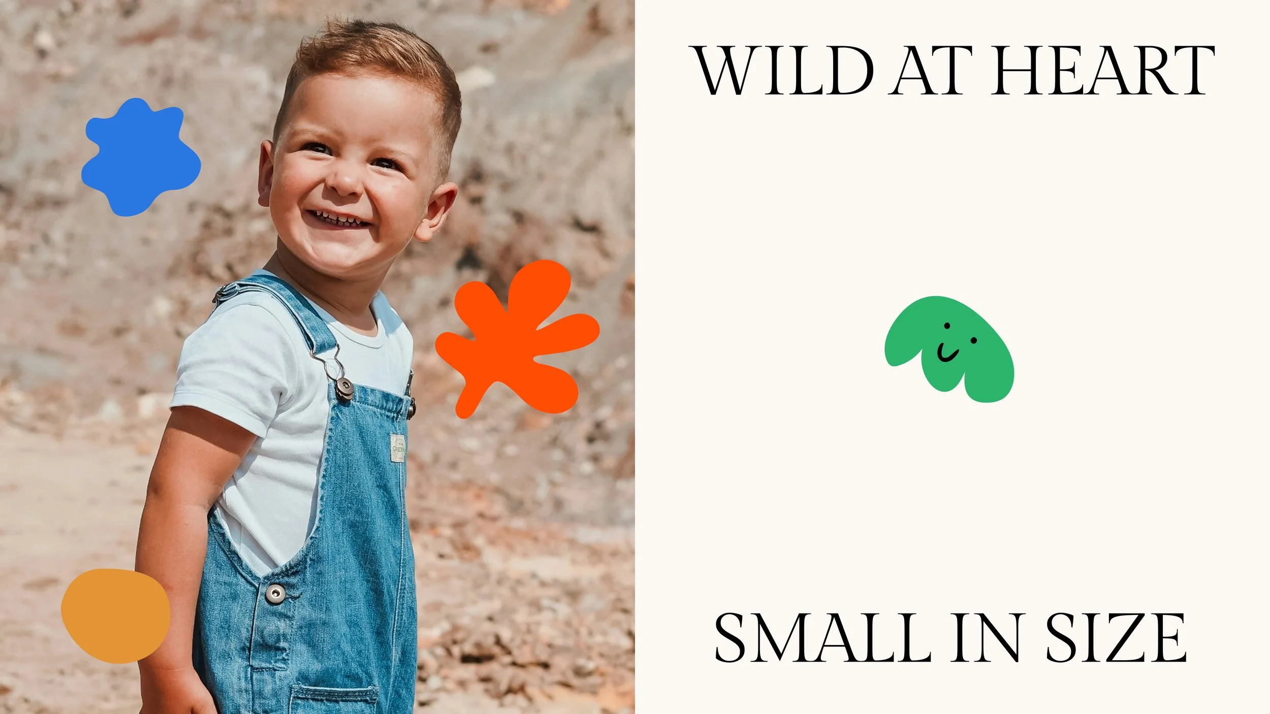
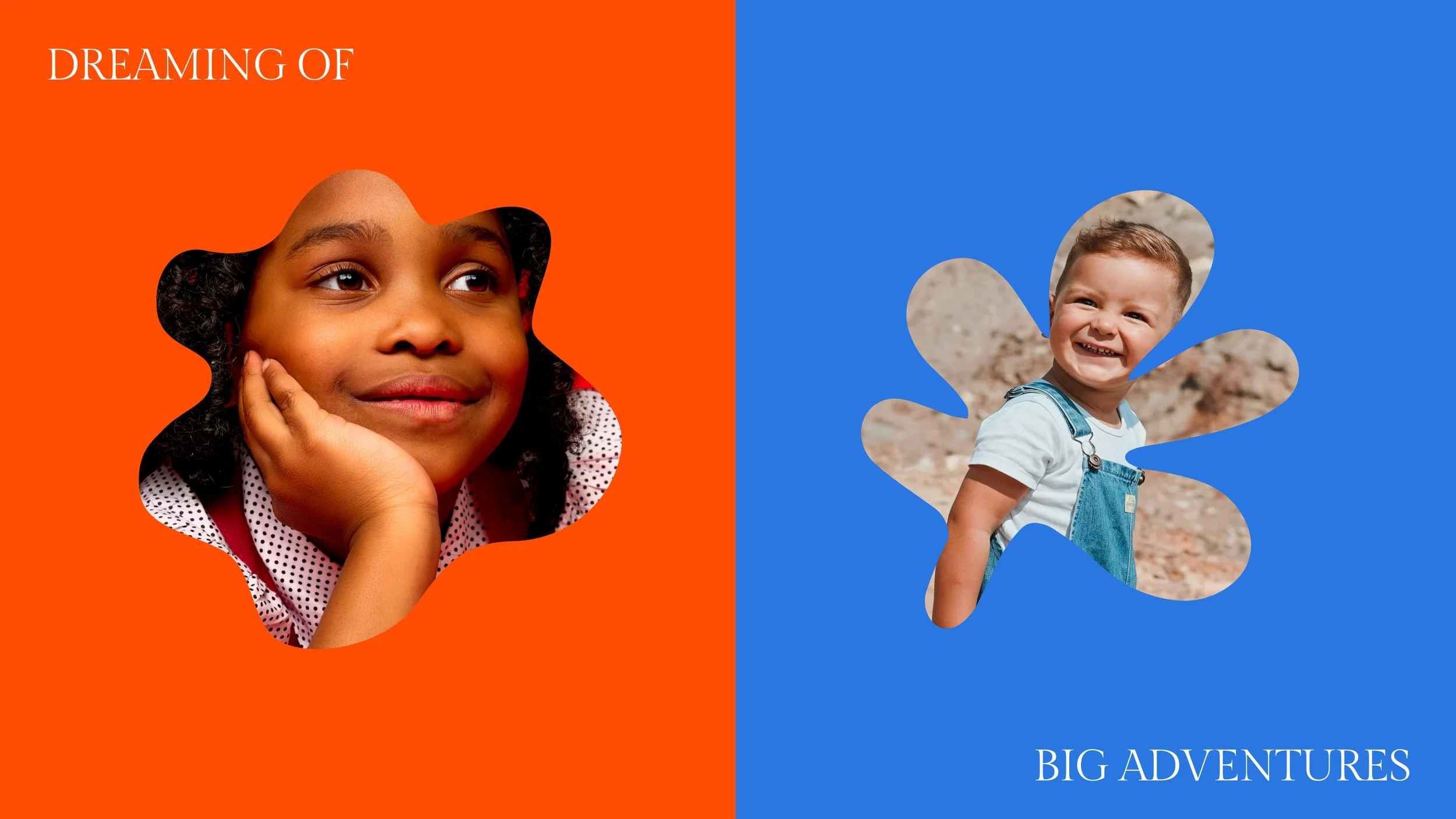
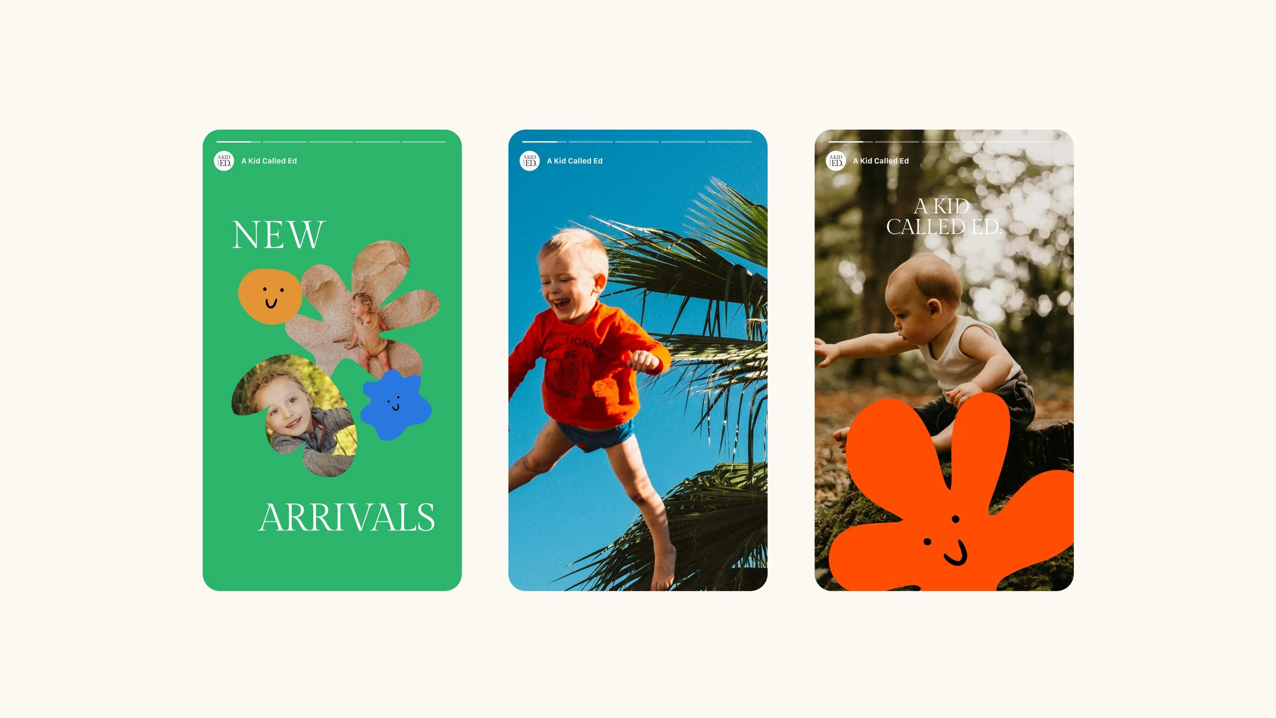
Designing for A Kid Called Ed was all about embracing curiosity, fun, and a sense of adventure. I wanted the brand to feel like a little spark of joy - bold, playful, and full of personality. The logo and supporting assets play with unexpected shapes and cheerful smiley-face illustrations, adding moments of surprise and whimsy at every turn.
The photography mirrors this energy, capturing playful, adventurous moments that feel genuine and full of life. Typography and colours were chosen to feel confident but approachable, giving the brand a voice that’s friendly, fun, and unapologetically bold.
Ultimately, the goal was to create a world that celebrates imagination, courage, and the thrill of discovery - a brand identity that feels alive, vibrant, and as adventurous as the kids it’s made for. A Kid Called Ed isn’t just a label; it’s a little invitation to play, explore, and embrace the joy of being a kid.